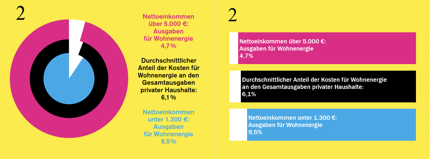
Please, somebody should do a scatter plot! Or maybe bars for workers per Euro?
Ironically, I found the pie chart (!) on a German site about manipulation with statistics.
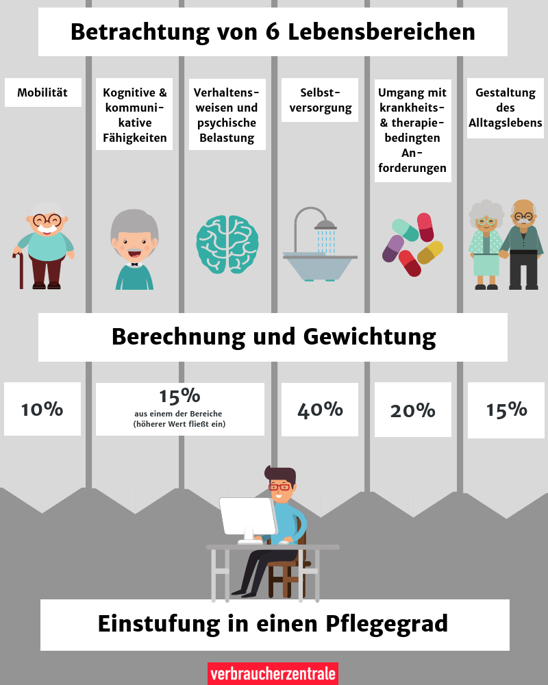
Graphic source: https://www.verbraucherzentrale.de/wissen/gesundheit-pflege/pflegeantrag-und-leistungen/was-pflegegrade-bedeuten-und-wie-die-einstufung-funktioniert-13318
Local votes are a bit more private.
Default mode: public.

 PieFed